Bank of America Email
As another path to reaching Bank of America clients, the Financial Center emails are used to invite clients and potential customers to visit, or call, an advisor to better manage their finances. This email goes out seasonally, and design is tailored according to its respective time in the year. With this award winning design, I have the honor of spearheading the innovative execution of the whole email; including concepts, animation, and updates.
Progressive Email Pitch
While working in an agency, new business is always an exciting endeavor. When we received the ask to prepare a pitch for Progressive, things were no different. We were asked to prepare a campaign for their Quarterly Loyalty Statement. I was assigned the Email Layouts — the copy and basic brand assets were provided.
The main purpose of this email is to encourage clients to continue to stay with Progressive, but also push them to benefit from more services. This would give them the potential to gain a higher ranking in the Loyalty Program, and receive access to more benefits. In order to do this, I designed the email in a way that would pull on multiple visual elements to drive the Click-through rates, and the overall success of the email. Implementing illustrations, links to more resources, tips from Flo, and social media links, the client has access to convenient resources as a Loyalty program member.
*Some assets are taken from the already existing Progressive brand in order to align with their look & feel consistently.
Erica® Emails
Erica is an app feature provided through the Bank of America Mobile app. These emails were designed to showcase the answers and tools that Erica has to offer. Using the landing page as a reference, the fluency of the content and appearance is present through all major touch points. Aside from the layout, the top and middle animations were created as well to better showcase the UX, and how to arrive at the resources that are readily available through a dynamic graphic.
ESS Email
While working with a newer program like Figma, and Photoshop in conjunction, I laid out designs for a campaign coming up geared towards providing awareness of who ESS is. The designs leverage the updated branding, icon animation, organic shapes, and a streamlined view of information.
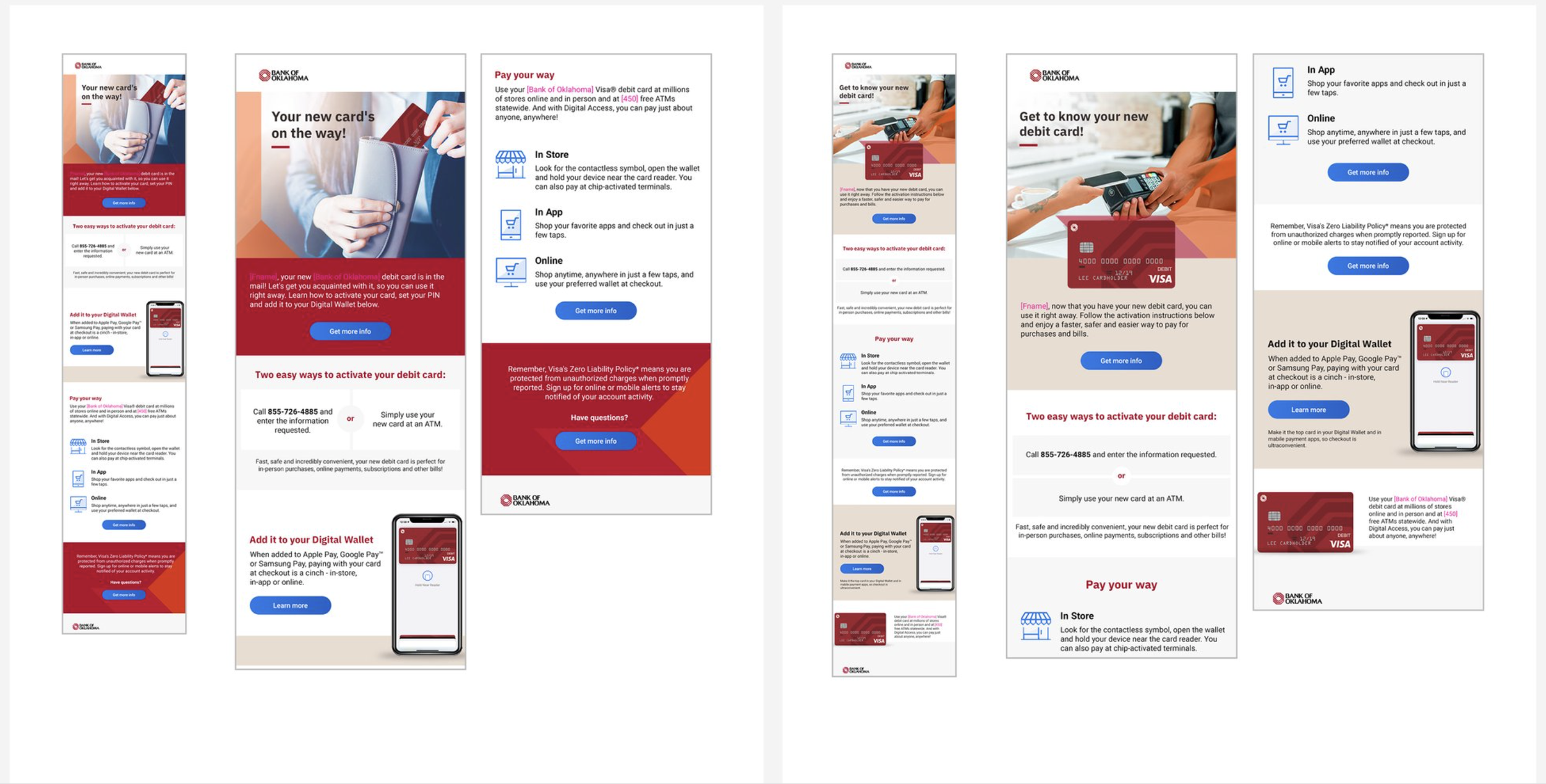
Bank of Oklahoma Email
New Debit Card Email
With a modular, easy-to-digest approach to email layouts, the retainability of information and core messaging is strengthened. These layouts execute both of those methods and create for concise and dynamic layouts that encourage CTR growth and the ability to stand out amongst competitive markets.
Email Refresh
These layouts break fromt he usual approach for BofA emails. You will see modular color blocking to make the information more readable, animated assets, and branded color variety.


